
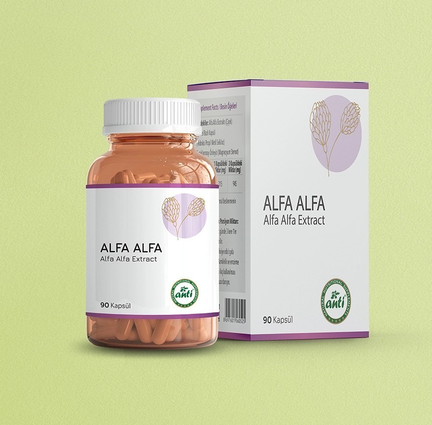
Anti is a natural nutritional supplements brand. On shelves and screens full of look-alike products, it needed a packaging language that is simple, trustworthy and easy to tell apart.
We designed a layout built on a white base, a thin colour band and a line illustration of the plant. The bottle label and the box share the same language, and the product name, supplement facts and directions sit in a clear, readable order.
We also designed and built the e-commerce site in the same language as the packaging, so the products look on screen the way they look on the shelf.
What we did
- Packaging system: bottle label and box
- Product illustrations
- E-commerce site design and development